Service Designer & Researcher
Rosa Torguet
Guiding organizations in their journey towards outstanding digital services their users love.
A sneak peek of
six projects I put
my heart, brain &
hands into.
Project 1
Designing a new public policy and its digital service ecosystem.
Client - Spanish Ministry of Work, Social Security and emigration
Sector - Public sector, emigration policy
Responsibilities - Research & strategy, information architecture, UX/UI and visual design, pilot program.
Objective - Design and pilot a new public policy oriented to facilitate the return of Spanish emigrants to their homeland.
Project duration - 2 years
Approach - To tackle the creation of the new public policy, I joined forces with Volvemos.org, a non-profit that facilitates the return of Spanish expats. With participation at the core of the methodology, I proposed a design thinking process to tackle the engagement of Spanish emigrants, different government departments and companies with interest in hiring Spanish talents with international experience. After 5 months of learning and planning to give shape to the new policy, the plan was approved by the Cabinet of Ministers in March 2019. A pilot program, with 200 participants, integrating key services through a centralised digital platform started in June 2019 and lasted one year.
Open meetings and participatory workshops took place in London, Berlin and Madrid.
Pilot onboarding experience for participants.
Wiki article high fidelity prototype, one of the main platform sections, displaying categorised information relevant for Spanish emigrants willing to return.
Pilot program management dashboard design showcasing live participation indicators, high fidelity mockup.
Admin panel with pilot program participant overview, high fidelity mockup. This was the platform’s most visited section throughout the pilot program. It was used by the management team as well as the career and business venture counsellors.
Low fidelity wireframe to explore the platform concept.
Style guide
Social network imagery.
Infographic that summarises the evaluation methodology and pilot program results.
Project 2
NEXO, the employee app for the biggest department store group in Europe
Client - El Corte Inglés, in collaboration with Accenture
Sector - Retail, department store, employee experience
Responsibilities - Workshop design and facilitation, user research & UX design.
Objective - Design the digital experience that brings into one place different services that employees use daily such as work schedule, payslip, incentives and team contacts.
Project duration - 9 months
Approach - The project was organised to develop and deliver app features to the client team on a sprint basis. To keep up with the fast-paced development environment the research and design actions informed the process with the aim of integrating users’ perspective along the way.
Throughout the project, I ran client workshops to define project goals, conducted employee interviews to identify the most pressing needs, and usability testing sessions with interactive prototypes. Along the design phase, I sketched user flows for each app feature and followed the development work closely.
After 7 months of intense work, El Corte Inglés ran a pilot experience to test the app with employees in one of their shopping centers. After the pilot, I run user feedback sessions to detect relevant feature improvements.
The official launch positively surprised the executive board of directors with a 47% employee download rate within the first weeks. NEXO has a 4,2 review score on Google Play and sums more than 100.000 installs.
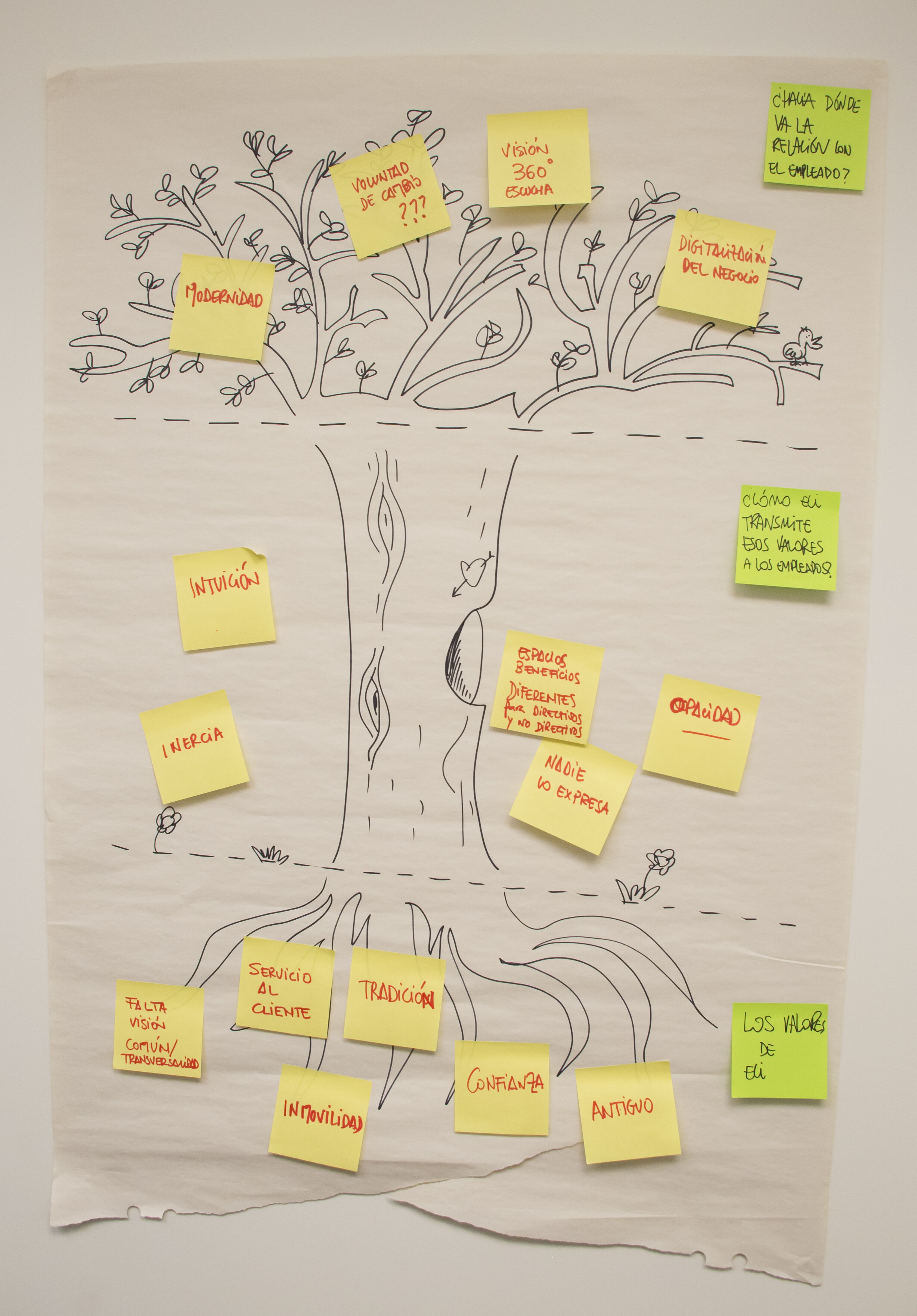
Several strategy workshops took place at the beginning of the project to align stakeholders around the values that the new digital experience would instil in employees.
Low fidelity wireframes were used to continuously communicate with the development team.
NEXO was designed to deliver services that are used on a daily basis by employees and to inform them about relevant company news.
Given the number of internal services that were available for employees across different desktop applications, defining the user menu categories was one of the main UX challenges.
Project 3
Places, the app for Accenture employees
Client - Accenture
Sector - Tech consultancy, employee experience
Responsibilities - Design lead, information architecture, user research, UX design, usability testing
Objective - Design an app for Accenture employees to reserve work spaces, access local content, and receive support.
Project duration - 1 year
Approach - Places was designed in an agile development environment with remote teams based in the USA, Ireland, Spain, Philippines and Argentina. Together with a visual designer I was in charge of designing the app concept and defining feature user flows following the Material Design principles.
Once the concept was approved by the US client team, the design efforts focused on delivering key features in the form of user stories on a sprint basis. During the project, I conducted several usability tests that helped improve the app navigation and new UI components that enriched the design system.
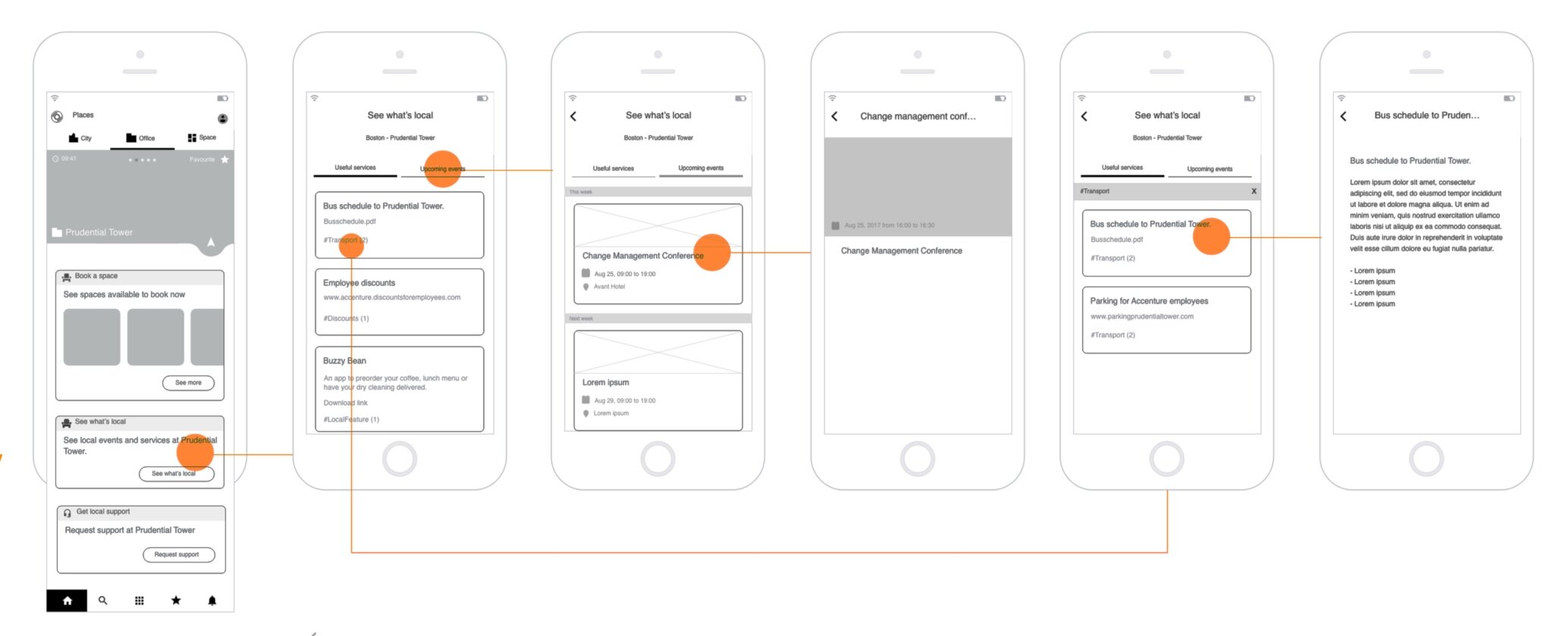
Navigation wireframes that served to communicate to the client and development team how employees can access local information only relevant to the office they work from.
Defining card typologies and their possible states was key to effectively communicate with the development team.
Places aims at making Accenture employees live easier by supporting them in daily tasks that usually take up too much time. Personnel can access services at a city, office or space level. The app was designed to serve busy commuters that often travel between several offices across the world as well as employees who spend most of their time at the same office.
Project 4
Web design for Barcelona’s Return Plan
Client - Barcelona Activa from Barcelona’s City Hall
Sector - Public sector, emigration policy
Responsibilities - Information architecture, UX/UI and visual design
Objective - Design the desktop and mobile website for Barcelona’s Return Program (Return amb Oportunitats) for three key target users: emigrants who wish to return, organisations willing to hire professionals with international experience and program employees. The program launch will take place in October 2020.
Project duration - 6 months
Approach - The process involved close collaboration with the development team, who built the platform in a fast paced environment. Before creating hi-fidelity designs, I made a series of pen and paper wireframes that were useful to discuss main navigation and information architecture internally.
After aligning with the development team around the key aspects of the platform, I created the style guide. Using Sketch, I defined the design system and continued to produce high-fidelity mockups of the main sections and interactions. During the project, I ran user testing sessions and incorporated user feedback and development team feedback into my high fidelity prototypes.
Visual narrative concept, an emotional connection to Barcelona for emigrants who grew up in the city. The guideline and style guide include directions to design web banners, social network sharing images, etc. with selected imagery, iconography, color palette and typography.
Admin panel with participant overview
Home concept - high fidelity mockup
User profile high fidelity mockups for desktop and mobile. This section shows program participants:
The personal and professional information they provide when they register, that they can update anytime.
Who is their career counsellor and their next appointment with him or her.
Their welcome guide, for the time when they are about to return to Barcelona.
Project 5
Onboarding, the app that welcomes new Accenture employees
Client - Accenture
Sector - Tech consultancy, employee experience
Responsibilities - Design lead, user research, UX design, pilot program
Objective - Design an app to facilitate a personalized and engaging integration experience for individuals joining Accenture via an acquisition.
Project duration - 7 months
Approach - The initial user research uncovered how lost newly acquired employees felt throughout their transition to Accenture. The app concept is based on providing transparency and guidance through the process with all documents and upcoming milestones accesible from one place. Newly acquired employees usually feel anxious with regards to the process, the lighthearted visual narrative aimed at making them feel welcome and supported.
Project 6
Understanding wound care in hospitals
Client - Hartmann
Sector - Healthcare
Responsibilities - Project lead, user research, workshop facilitation
Objectives - Understand the buying process of Negative Pressure Wound Therapy (NPWT) devices that takes place in German and French hospitals to explore business growth opportunities. Observe how NPWT devices are currently used to depict possible product and service improvements.
Project duration - 3 months
Approach - Many stakeholders take part in the buying process of NPWT devices. Deciphering how the process unfolds in reality needed contextual in-hospital observation, interviews and mapping sessions with care givers, nurses, wound care specialists, doctors and hospital buyers. Research insights were activated in a workshop with the client team to inform their business strategy.
Thanks for making it all the way through!


